Design Thinking Workshops
Brief
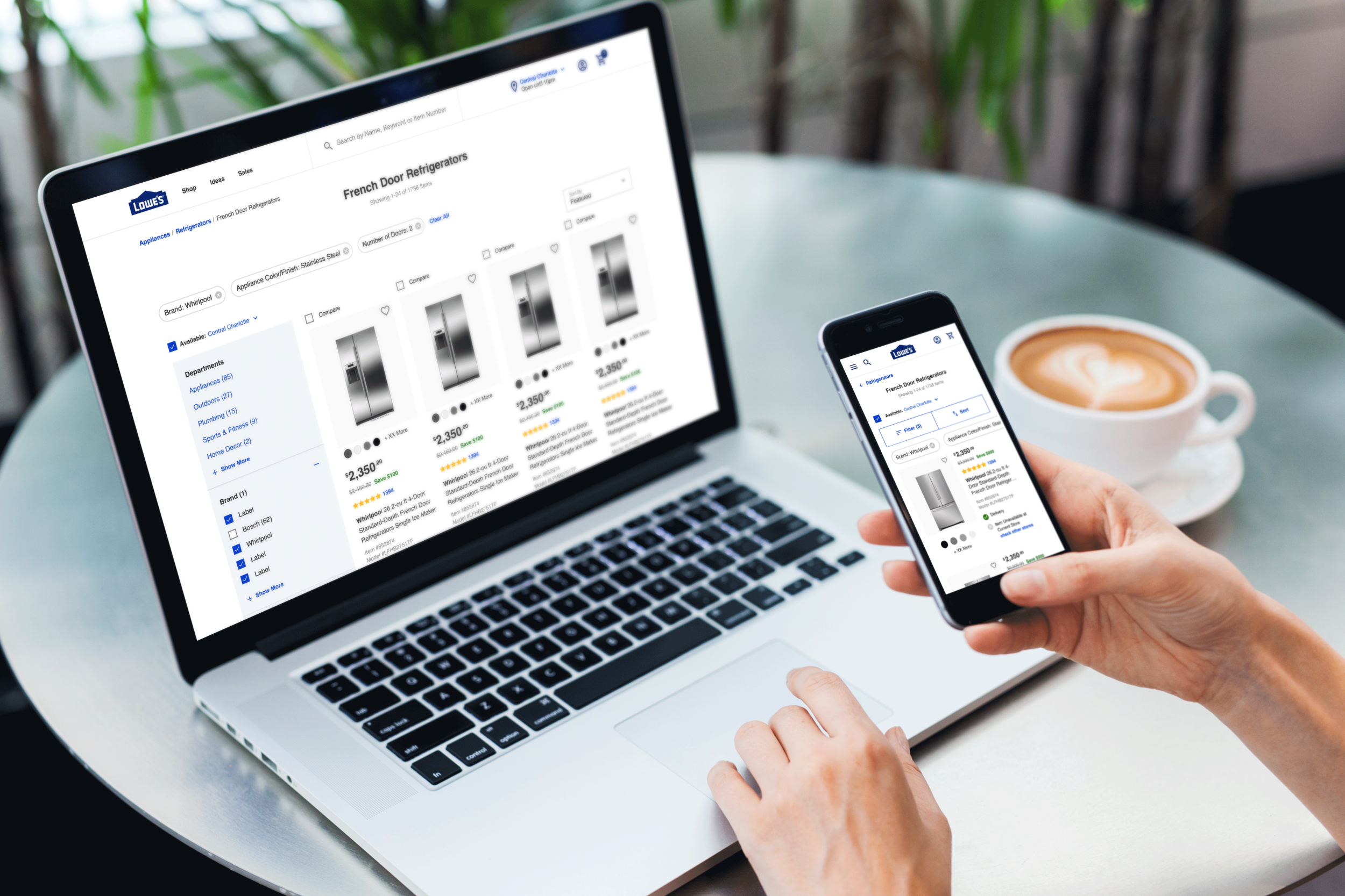
The Lowe’s product list page hadn’t seen a full-page update in approximately two to three years. In addition, it was lacking critical information, its usability was poor, and the UI was dated. With an enterprise-wide modernization effort in place, it was time to listen to user’s wants and needs and to re-imagine and redefine the product list page.
Process
01. Discovery + research
–
The first step in my process was to understand the wants and needs of the user as well as the current usability gaps in the experience. This included usability testing, interaction data, and analytics to really help understand the problem.
02. strategy
–
After understanding the problem and deep-diving into the user wants and needs, I worked with a content strategist and product manager to wireframe the page, understand user flows and interactions throughout the experience, and outline the hierarchy of the information on the page.
03. design
–
The design phase of this process was the most challenging. During this phase, I not only assisted with helping define patterns for the new modernized Lowe’s design system but was also challenged to expand the page grid by over 300px giving us the ability to have larger images and really showcase the critical purchasing information.
04. validate
–
In conjunction with a content strategist and my product manager, we released a series of user tests to validate the experience with customers. In addition, we released the validated experience into an A/B test to measure the conversion rate and benchmark the performance against critical KPIs.
